The best fonts for websites include Open Sans, Roboto, Lato, Montserrat, and Merriweather. These fonts are widely used because they offer strong readability, fast loading, and consistent display across devices and browsers.
Choosing the right typography improves how users read, navigate, and engage with your site. It also helps you choose the right font family, improve readability, and use modern web fonts that load fast across devices. In this guide, you will find the top font options, where to use them, and how to select the right combination for better design, performance, and user experience.
TL;DR
- The best fonts for websites include Open Sans, Roboto, Lato, Montserrat, and Merriweather.
- Choose fonts that improve readability, loading speed, and cross-device consistency.
- Use sans-serif fonts for UI and digital layouts, and serif fonts for long-form content.
- Limit font combinations to maintain design consistency and visual hierarchy.
- Optimize font sizes, line height, and spacing for a better user experience.
- Test typography across devices and browsers to ensure accessibility and performance.
Best Fonts for Websites: Quick Comparison
Choosing the best fonts for a website depends on readability, performance, and design style. Some fonts work better for body text, while others are ideal for headings or branding. This quick comparison helps you choose the right font based on your use case, visual style, and website content.
| Font Name | Font Type | Best For | Style | Why It Works |
|---|---|---|---|---|
| Open Sans | Sans-serif | Body text, blogs | Clean | Highly readable and versatile font for all screen sizes |
| Roboto | Sans-serif | UI, SaaS, apps | Modern | Designed for digital interfaces with strong clarity |
| Lato | Sans-serif | Business websites | Professional | Balanced structure with good readability and tone |
| Montserrat | Sans-serif | Headings, banners | Bold | Strong visual appeal with clean geometric design |
| Merriweather | Serif | Articles, long content | Elegant | Optimized for readability in long-form text |
| Playfair Display | Serif | Headlines, branding | Stylish | Adds personality and contrast for headings |
| Arial | Web-safe | UI, general use | Simple | System font that works across most devices |
| Georgia | Web-safe | Blogs, body copy | Classic | Strong readability for long content |
| Work Sans | Sans-serif | Modern websites | Minimal | Clean lines with good performance across devices |
| Libre Baskerville | Serif | Editorial content | Refined | Designed for easy reading on digital screens |
These fonts are widely used in web design because they improve readability, maintain consistency across different browsers and operating systems, and enhance the user experience.
Why Fonts Matter in Web Design
Fonts directly impact how users read and interact with your website. A clear, readable font improves user experience, reduces bounce rates, and helps visitors stay longer on your pages. Poor font choices can make content hard to read and push users away quickly.

The right typography also strengthens your brand and improves performance. Well-optimized fonts load faster, display consistently across devices, and support better accessibility. This helps your website look professional, perform better in search results, and provide a smoother user experience.
Find Out: How to Choose the Best WordPress Template Builder
How Fonts Affect User Experience on Websites?
Fonts directly influence how users read, scan, and interact with your website. A clear and readable typeface improves content clarity, reduces friction, and helps users process information faster across different screen sizes.
Typography also impacts trust, engagement, and usability. Clean, modern fonts create a professional experience, while inconsistent or hard-to-read fonts increase bounce rates and reduce time on site. Choosing the right font improves accessibility, supports responsive design, and creates a smoother user experience across devices and browsers.
Core Font Types Used in Web Design
Choosing the right font type is essential for readability, visual hierarchy, and overall design consistency.
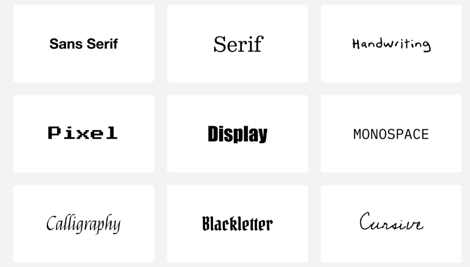
These are the three most effective font types used in modern websites:
- Serif Fonts: These fonts feature small decorative lines, or “serifs,” at the ends of their letters. They give a classic, formal, and traditional feel.
- Sans-Serif Fonts: Sans-serif fonts lack the little lines at the ends of letters, giving them a clean, modern look. They’re easy to read on screens. A sans serif typeface offers clean lines, a modern look, and better readability for digital screens.
- Display Fonts: Decorative or bold fonts used for headings, logos, or banners. They are eye-catching but not ideal for body text. They work best for display text, headings, and headlines, not for long paragraphs.
- Monospace Fonts: Every character in these fonts takes up the same amount of horizontal space. They give a technical or coding feel.
- Script Fonts: These mimic cursive handwriting, adding elegance or a personal touch. Use them sparingly, as they can be hard to read in large blocks.
How WPTasks Helps You Maintain Design Consistency and Performance?
Choosing the right fonts is only part of the process. Issues like inconsistent typography, slow font loading, or layout shifts can affect readability and user experience if not managed properly.

WPTasks helps businesses handle this with a structured subscription model. Monthly development hour retainers cover design fixes, font implementation, and performance improvements, while monthly maintenance subscriptions ensure consistency, updates, and ongoing stability.
Choose Better Fonts and Build a Website That Feels Right
The right font can change how your whole website feels. Get expert WordPress help to improve design, readability, and overall user experience.
Best Web-Safe Fonts for Websites
Not every visitor will have the same fonts installed on their device, which is why web-safe fonts are a smart and reliable choice. These fonts are pre-installed on most devices, making them ideal for maintaining consistency and legibility across different browsers and operating systems.
What Are Web-Safe Fonts?
Web-safe fonts are widely supported across devices, platforms, and browsers without requiring extra downloads. They’re essentially the universal fonts of the internet, safe, dependable, and fast-loading. Using web-safe fonts can be a great fallback strategy in any design project, especially when performance and compatibility are top priorities.
Top Recommended Web-Safe Fonts
Here are some of the most commonly used and trusted web-safe fonts:

- Arial: A versatile sans serif typeface known for its clean and modern appearance
- Verdana: Offers large letter spacing, making it highly legible, even at small sizes
- Georgia: A classic serif font with strong readability, ideal for long-form body copy
- Trebuchet MS: A stylish and functional sans-serif font suitable for user interfaces
- Tahoma: Compact and clear, great for both UI labels and content-heavy layouts
These fonts are especially helpful when your site needs to perform well on low-bandwidth connections or in environments where custom fonts may not render properly.
Check Out: Pros and Cons of Hiring a WordPress SEO Freelancer
Pros and Cons of Using Web-Safe Fonts
Here are the pros and cons of using web-safe fonts:
Pros:
- Consistent appearance across all platforms and browsers
- Faster load times since they don’t require loading external font files
- No licensing issues; these fonts are free to use and are already installed
- Great for improving legibility and accessibility
Cons:
- Limited in style and personality compared to custom fonts or unique fonts
- Not ideal for brands that want a distinctive or expressive typographic identity
- Fewer options for OpenType features, display text, or advanced glyph sets
- May not support extended characters for international websites (though some do cover Latin extended glyphs)
In short, web-safe fonts are perfect when you need reliability, performance, and cross-platform readability.
Top Google Fonts for Websites
When it comes to combining style, performance, and legibility, Google Fonts is a top choice for web designers and web developers. It offers a large library of free, easy-to-integrate web fonts optimized for fast loading.
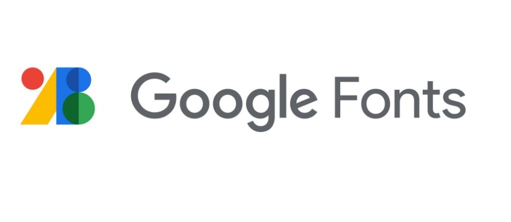
One of the best parts? Google Fonts are hosted on reliable servers, so you don’t need to host font files yourself. That means better speed, easier implementation, and consistent visual appeal across international websites.
Here are some of the best Google Fonts that balance aesthetics with usability:
- Open Sans: A clean sans serif font known for its legibility on screens. With a modern look and five weights, it works beautifully for both body copy and headings.
- Roboto: Sans-serif Roboto is a staple in modern web design. Roboto’s geometric structure and mechanical skeleton give it a clean, professional feel, ideal for design projects that need to look polished yet approachable.
- Lato: Lato blends a friendly tone with a clean structure. It includes multiple weights, supports OpenType features, and maintains clarity on most devices, making it a great pick for startups, SaaS websites, and blogs alike.
- Montserrat: Looking to make a bold statement? Montserrat is a modern geometric sans-serif font with a unique personality. It’s ideal for display text like hero sections, banners, and headers.
- Merriweather: Merriweather is a serif font designed specifically for screen readability. With a slightly condensed style and generous x-height, it’s perfect for easily readable content, especially on mobile.
- Raleway: If you want something elegant yet clean, Raleway is a great choice. This unique font is great for headlines and pairs well with other fonts like Roboto or Open Sans for contrast. It comes in several weights, making it versatile for both bold headings and subtle accents.
- Source Sans Pro: Developed by Adobe, it was designed for user interfaces. It’s a clean sans-serif font with excellent legibility, great file performance, and robust character support.
Best Fonts by Website Type
Here’s a breakdown of the best fonts based on your website’s purpose:

Fonts for Blogs and News Sites
For content-heavy sites, legibility is key. Fonts like Libre Baskerville, Merriweather, and Open Sans work well because they’re easily readable, even at small sizes.
These fonts offer excellent support for Western European languages and Latin extended glyph sets, making them ideal for international websites and long-form reading. Pair a serif font for body copy with a clean sans serif for headlines to create contrast and clarity.
Fonts for eCommerce Websites
For online eCommerce stores, especially those targeting conversions, you need fonts that are clear, consistent, and professional. Lato, Roboto, and DM Sans are excellent choices.
These web fonts come with multiple weights, allowing you to create bold CTAs and readable product descriptions. Their simplicity enhances visual appeal and builds trust, both of which are essential for marketing and driving sales.
Fonts for Creative Portfolios
Creatives often lean toward more expressive, unique fonts that mimic handwriting or have a strong personality. Fonts like Raleway, Playfair Display, and the Rubik font family provide a perfect balance of style and structure.
These fonts let you stand out while maintaining legibility, especially when showcasing design work, photography, or branding.
Fonts for Tech and SaaS Websites
Tech brands need to convey clarity, innovation, and reliability. Fonts such as sans-serif Roboto, Work Sans, and Source Sans Pro are excellent for these sites.
Their geometric sans serif construction provides a modern, sleek look, while their performance across most devices ensures a seamless user experience. These fonts support OpenType features and are ideal for complex user interfaces.
Fonts for Corporate or B2B Sites
For professional, corporate websites, or B2B websites, fonts should emphasize trust and professionalism. Montserrat, Lato, and Georgia offer a refined, business-like appearance. They’re great for body copy, CTAs, and display text, and they support five weights or more, helping you ensure consistency across all sections of your site, from service pages to blog posts.
How to Choose the Best Fonts for a Website?
With so many web fonts available, picking the right one for your site can feel overwhelming. But if you focus on a few core principles, readability, brand alignment, and device compatibility, you can make smart font choices that elevate your design project and boost user engagement.
Readability on Screens
First and foremost, your font must be easily readable. Choose typefaces that maintain legibility at small sizes, especially on mobile devices.
Fonts like Open Sans, DM Sans, and sans-serif Roboto are designed specifically for digital interfaces and display well across various operating systems and different browsers. Also, make sure your chosen font renders crisply on both standard and high-resolution screens.
Brand Personality Alignment
Your font should reflect your brand identity. For example, a geometric sans serif like Montserrat can convey modernity and professionalism, while a unique font that mimics handwriting can evoke creativity and warmth.
Think about how you want users to feel when visiting your site; your typography should visually reinforce that emotion.
Compatibility Across Devices and Browsers
To ensure consistency, always choose fonts that are supported by most devices and include broad Latin extended glyph sets for Western European languages and beyond. This is especially important for international websites. Google Fonts, such as the Rubik and Lato families, are excellent because they’re optimized for site performance and render well across all platforms.
Font Pairing Tips (Heading + Body)
Pairing fonts effectively can enhance your visual appeal and content flow. A common approach is to combine a bold, stylish font for headings with a simple, clean font for body copy. For example:
- Headings: Playfair Display or Raleway
- Body: Open Sans or Work Sans
This contrast keeps users engaged and enhances the information hierarchy on your site. When combining fonts, make sure their x-heights and letter spacing work well together, and test the pairings in your actual layout.
Recommended Font Sizes and Line Heights
To make your text comfortable to read, stick to these general guidelines:
- Body copy: 16–18px font size, 1.5–1.8 line height
- Headings: Scale accordingly (e.g., H1: 32–40px, H2: 24–30px)
- Avoid overly tight or loose line heights, as they impact readability and can increase bounce rates
Keep accessibility in mind; your fonts should remain legible for users with visual impairments, too. And don’t forget performance: use only the weights you need to keep file sizes small.
Know More: Essential Guide to Outsourcing WordPress
Common Font Mistakes to Avoid
Even great typefaces can fall flat if used incorrectly. Watch out for these common pitfalls that can hurt your website’s user experience and brand identity:
- Using Too Many Fonts: Mixing four or five fonts on a single site can confuse users and dilute your message. Stick with a maximum of three and make sure they pair well stylistically and functionally.
- Inconsistent Sizing and Formatting: Random changes in font size, weight, or color can make your site look unprofessional. Establish a clear typographic hierarchy and apply it uniformly across your content.
- Choosing Overly Ornate or Decorative Fonts for Body Text: Fonts that mimic handwriting or have too many flourishes may look creative, but they’re hard to read, especially at smaller screen sizes. Use them sparingly for display text or visual flair, not for paragraphs or essential information.
- Ignoring Performance and Compatibility: Custom fonts with large file sizes can slow down your site. Stick to optimized web fonts from sources like Google Fonts, and make sure your typography looks good on both desktop and mobile.
- Skipping User Testing: A font might look perfect in your design tool, but render poorly in real-world use. Always preview your typography across multiple devices and browsers to catch spacing, rendering, or legibility issues.
Know More: How to Hire WordPress Developers
Conclusion
In conclusion, selecting the right font is not just about aesthetics; it’s a critical factor in crafting a visually appealing, user-friendly website. The font you choose plays a key role in readability, brand identity, and user experience. It can influence how users perceive your brand, how easily they navigate your site, and how engaged they feel while browsing.
By following these guidelines, you can choose fonts that not only enhance your website’s design but also improve its functionality, performance, and user engagement, ultimately creating a more successful and professional online presence.
FAQs About Website Fonts and Typography
What are the best fonts for websites?
Fonts like Open Sans, Roboto, Lato, Montserrat, and Merriweather are widely used because they offer strong readability, fast loading, and consistent display across devices.
Which font type is best for readability on screens?
Sans-serif fonts are best for screen readability. They provide clean and clear text, making them ideal for digital interfaces, mobile devices, and modern websites.
How many fonts should I use on a website?
Use no more than two or three fonts. One for headings, one for body text, and an optional accent font. This helps maintain consistency and improves visual hierarchy.
Does font choice affect SEO and performance?
Yes, fonts impact loading speed, readability, and user experience. Optimized fonts improve page speed and engagement, which are important ranking factors.
What is the ideal font size for websites?
Body text should typically be between 16px and 18px with proper line height. Headings should scale proportionally to maintain clarity and structure.
How do I choose the right font combination?
Pair a bold or decorative font for headings with a simple, readable font for body text. Make sure both fonts work well together and maintain consistency across the site